- Template site — looks identical to 200+ other dental offices. Stock photography of perfect teeth, no photos of the actual practice or team.
- "New Patients Welcome" appears below the fold. The single most important message for practice growth is buried.
- Services listed as a sentence-long bulleted list with no descriptions. A prospective patient cannot tell what a crown involves, who is a good candidate for Invisalign, or what a first visit looks like.
- No mention of insurance accepted or payment options above the footer. Payment anxiety is a leading reason people delay dental care. The site makes it worse.
- The "Book an Appointment" button routes to a phone number, not an online form. Mobile users hit a dead end after 9pm.
- No photos of Dr. Chen above the fold. Patients choose dentists as much on comfort with the person as credentials — and they need to see her.
- No acknowledgment of dental anxiety anywhere on the site.
TRANSFORIO / QA
Releasechecked
CLEARVIEW DENTAL- QC-01Works on every screenNo sideways scrolling at 390, 768, 1440 px wide, on its page.PASS
- QC-02Accessibility0 WCAG 2.1 A/AA or best-practice violations from axe-core on its page, re-checked in every open menu, tab and panel at desktop and phone width. A skip link comes first, every keyboard stop shows focus, and tab widgets answer to arrow keys.PASS
- QC-04SEO fundamentalsTitle, description, a single main heading, language and viewport are set on its page.PASS
- QC-06Links2 internal links checked; none broken.PASS
Automated checks on every page found by crawling the production build, run October 1, 2026. Speed is measured on live hosting at launch, and forms are tested end to end, so neither is claimed here.
The practice was fictional. The reasons people postpone care were not.
The exercise begins with a capable family practice whose most persuasive facts—new-patient availability, insurance support, comfort accommodations, and urgent access—are buried inside a familiar dental template.
- Business
- Family and cosmetic dental practice
- Audience state
- Comparing options, cost-conscious, anxious, or in pain
- Primary offer
- Clearly explained care with online appointment requests
- Language access
- Complete English and Spanish experiences
- Primary conversion
- Request an appointment or call for urgent care
- Industry visual system
- A warm healthcare system built from deep teal, soft clay, pale oak, charcoal, and controlled editorial scale. Documentary consultation photography, asymmetric composition, fine rules, and a single humanist type family make the practice feel calm and current without teeth icons, clinical-blue gradients, or a generic dental template.
The design starts with the question keeping a patient from booking.
Every major section resolves a practical barrier—whether the practice is accepting patients, takes insurance, understands anxiety, offers urgent help, or makes the next step feel safe.
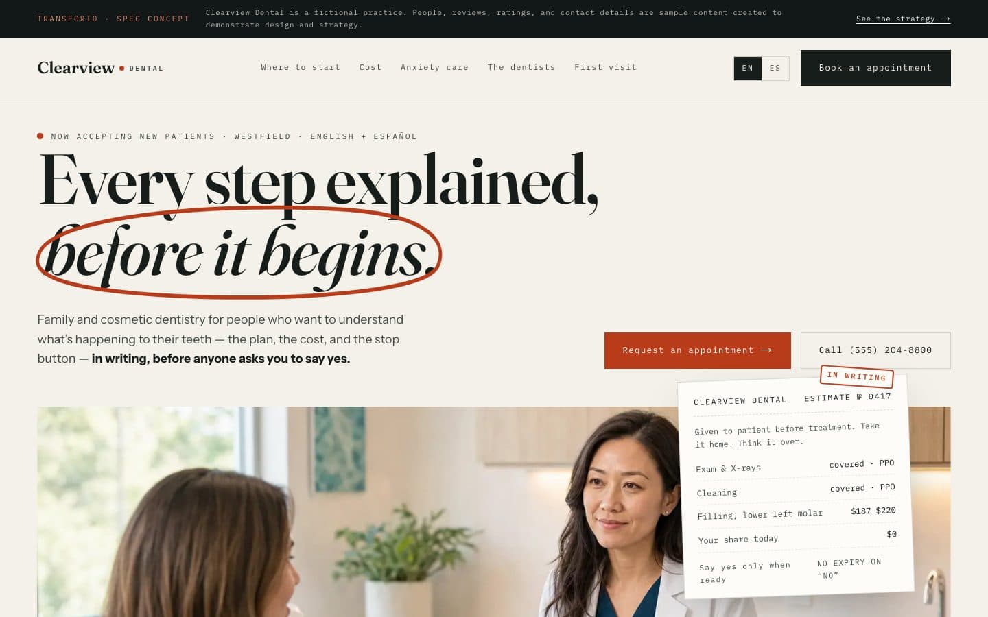
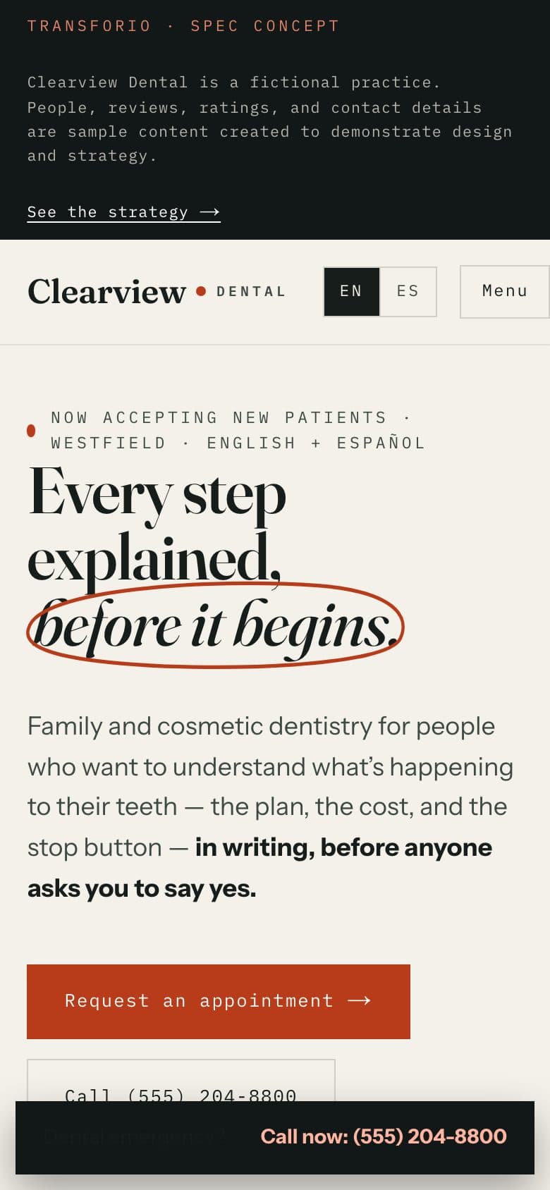
- "Accepting New Patients" leads the hero — it is the most commercially important fact and was previously buried.
- Show the practice and people in the first scroll. Stock teeth photography is a category tell; documentary care photography differentiates immediately.
- Services get plain-language descriptions written for a patient, not a dental textbook: who it is for, what it involves, and what to expect.
- Insurance and payment options surface before a long service explanation because they are gating questions for many new patients.
- Dental anxiety receives a dedicated comfort plan with specific accommodations instead of being treated as a footnote.
- Online appointment requests remain available at all hours, while one-tap calling supports urgent and business-hours needs.
- English and Spanish access is visible in the navigation and delivered as a complete translated experience, not a decorative language label.
A dental website that reduces uncertainty before it asks for commitment.
The result guides each visitor toward the information they need, turns comfort and cost transparency into visible reasons to choose the practice, and carries that experience fully into Spanish.
- A standalone, responsive dental showcase organized around patient decisions rather than the practice sitemap.
- A documentary hero that pairs a human consultation moment with accepting-new-patients status and two immediate appointment paths.
- Four intent-led routes for checkups, pain, smile goals, and dental anxiety, each connecting a real concern to the right reassurance and next step.
- An early insurance and payment section covering PPO participation, pre-visit verification, written fee estimates, and CareCredit without promising coverage.
- A named comfort plan, a human introduction to Dr. Lisa Chen, family-care storytelling, and a time-based first-visit narrative.
- A focused appointment-request form plus a persistent mobile emergency call path.
- Complete English and Spanish pages with working language switches and a dedicated Spanish phone line.
- Visible disclosures separating fictional people, reviews, ratings, and operating details from Transforio's real strategy and design work.
- Hero → book an appointment or call the practice
- Patient intent → matched service, reassurance, and next action
- Insurance confidence → verify a plan before the visit
- Anxiety support → share concerns in the appointment request
- Dentist introduction → continue to first-visit expectations
- First-visit narrative → request an appointment
- English / Spanish switch → complete localized booking path
- End-of-spec explanation → contact Transforio
Disclosure
Clearview Dental, its dentists, team, phone numbers, location, reviews, ratings, and operating details are fictional. This concept demonstrates Transforio's strategy and design judgment; it is not a client engagement, healthcare advice, or a claim of business results.