
Work
How we take a website apart — and rebuild it to work.
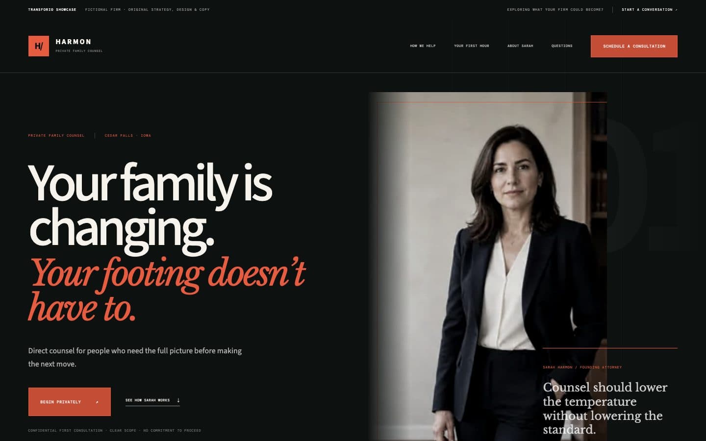
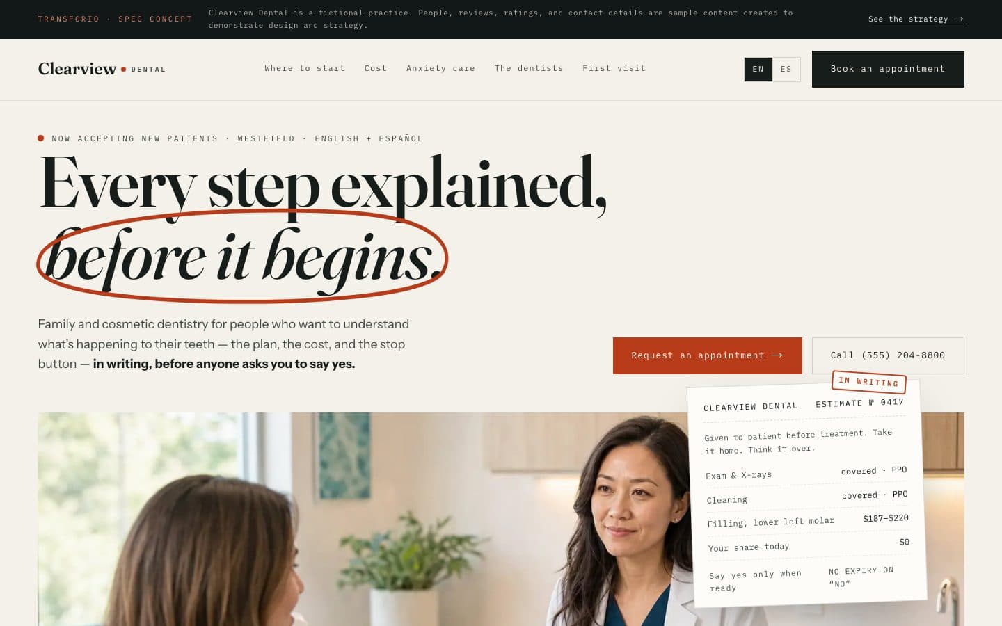
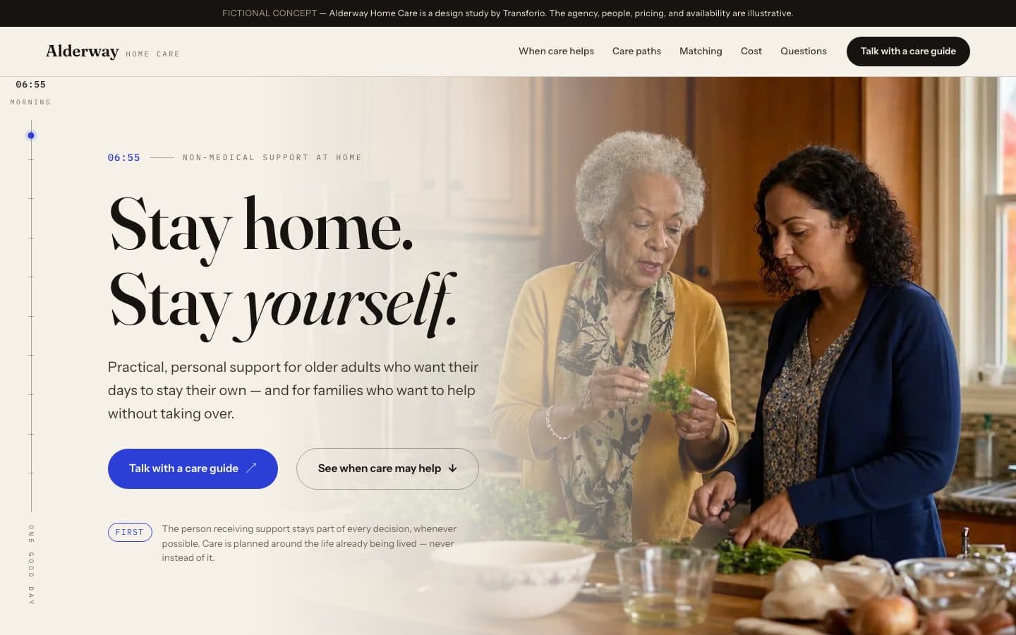
We publish case studies only with a client's permission and only with claims we can stand behind, so this page shows you something more useful in the meantime: the exact anatomy every project is evaluated and rebuilt against.
What a project looks like on our desk.
An illustrative walkthrough of the framework — not a real client. When published case studies join this page, they'll follow this same structure.
- The homepage never states what the business does, for whom, or where — visitors have to assemble it.
- The strongest proof the business has (years of real reviews) is nowhere on the site.
- On a phone, the menu breaks and the phone number takes four taps to find.
- Service pages don't exist, so search engines have nothing to rank for the work that pays best.
- Lead with the highest-margin service, not an alphabetical list of everything.
- Answer the three questions every prospect asks — before they have to ask.
- Put real proof (reviews, credentials, the work itself) beside every claim.
- One conversion path per page: call or request, never a maze of options.
- First: what you do and who it's for, in one sentence a stranger understands.
- Second: why this business over the other tabs the visitor has open.
- Third: what to do next, and what happens after they do it.
- Every page ends in a clear next step, sized for thumbs, visible without hunting.
- The phone number is one tap on mobile, always.
- Forms ask only what's needed to respond well — and are tested end to end.
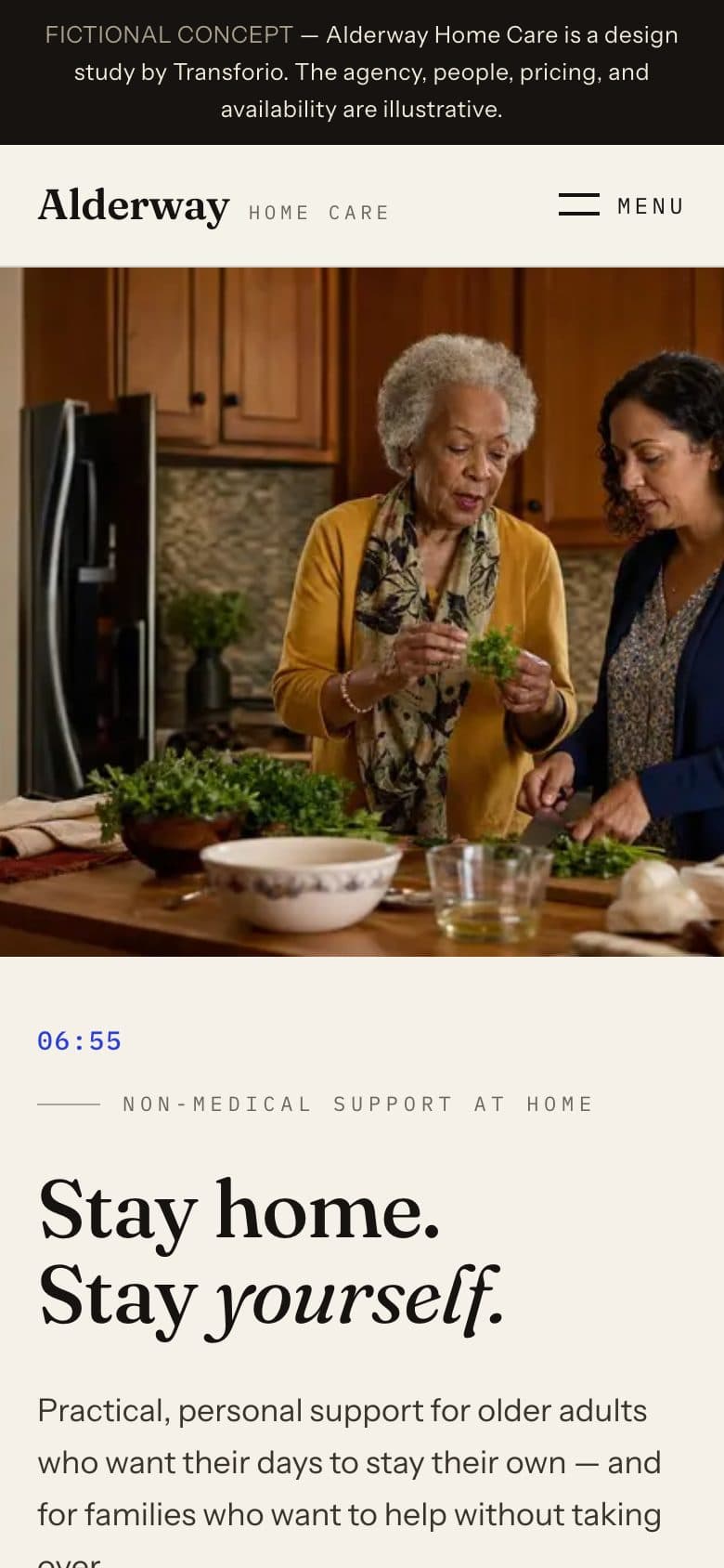
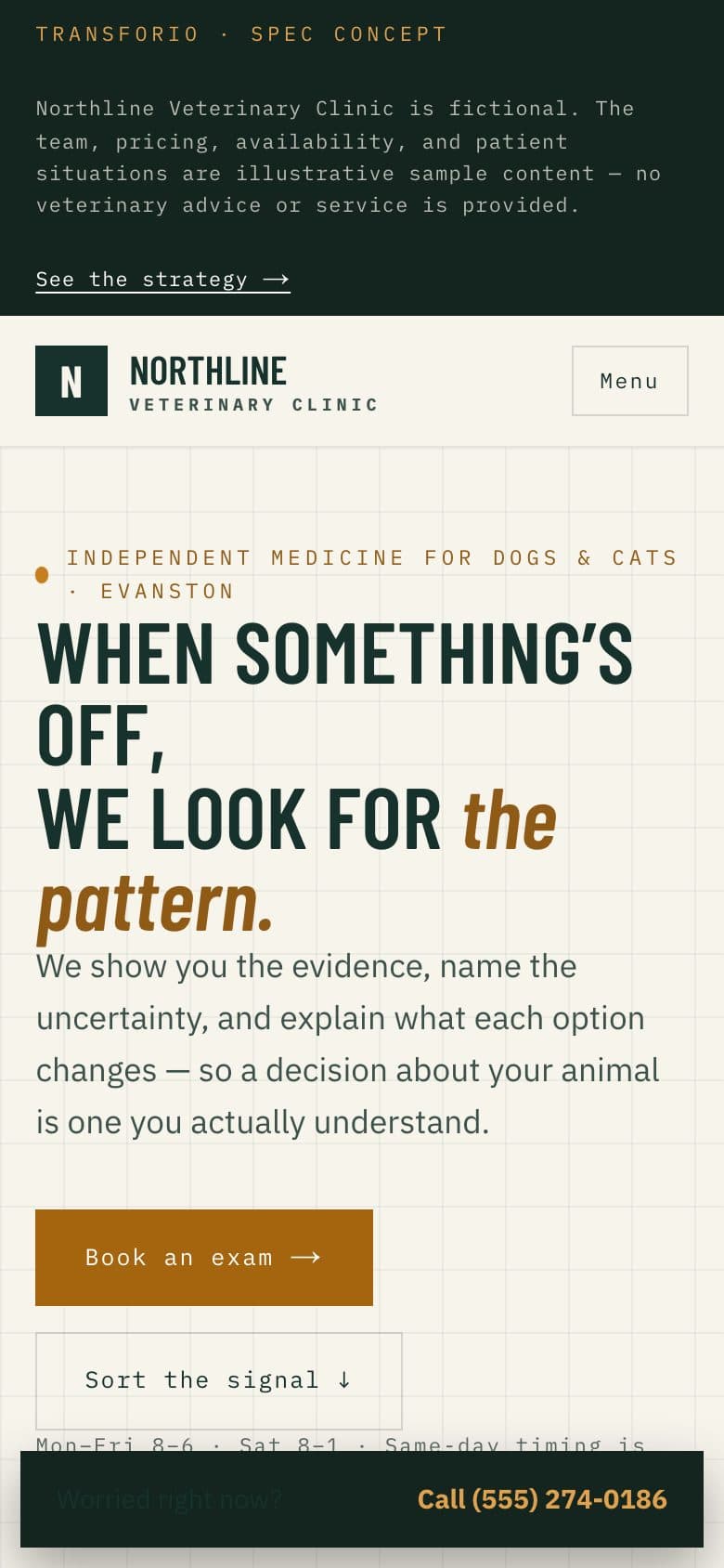
- Sections recompose for small screens rather than shrinking until they're unreadable.
- Tap targets, type sizes, and content order are designed for phones first.
- The finished site passes the same release checklist as every Transforio project: responsive, accessible, fast, findable, working — verified page by page before launch.
Six questions we put to every website.
This is the lens we'll put on your current site too — ask us for an honest read.
Before-state problems
What the current site gets wrong: unclear offer, weak trust signals, friction, invisibility in search.
Strategic decisions
The choices that shaped the rebuild — positioning, structure, emphasis — and the reasoning behind them.
Messaging hierarchy
What a visitor learns first, second, and third — and why that order sells.
Conversion paths
How each page moves a visitor toward calling, booking, or inquiring.
Responsive behavior
How the design recomposes across phone, tablet, and desktop — not just shrinks.
QA results
The release checklist the finished site had to pass before launch.
Curious what this lens finds on your website?
Send us your address and a line or two about the business. We'll reply with a plain-English read on where your current site helps you — and where it costs you.